Thursday

The Genius of Moving Image (PART 2)

1. What is the role of the cinematographer in filmmaking?The cinematographer is a role made up of two key elements, he is the visual aid of guiding the audience through the film how the director evisioned it and also controls the lighting and composure to form the story.

2. Why did director Roman Polanski insist on using hand-held camera in the film China Town?
Polanski prefered to use a hand held camera to shoot the film because it created an intimate moment. He wanted that ‘voyeuristic’ look. Also it was much easy to handle and control and he was able get different angled shots, made everything alot easier to shoot.

3. Name two films which use colour in a symbolic way and describe what they suggest
- Days Of Heaven (1978)- Directed by Terrence Malick.
This film was filmed only using natural lighting, and even when the sun sets he still liked the skys magical soft light (just light and no sun) this only lasted about 25 minutes but he filmed scenes in this time to give it a more beautiful touch.

- Goodfellas (1990) - Director Martin Scorsese
Goodfellas is a typical example of strong use of colour, throughout the whole film evidently is the colour red. It can be associated with blood, sex, violence, suffering, and passion. All strong key elements of the film and its represented through a red tone works very well to set the mood of the movie.


4. In the film 'Raging Bulls' why was the fight scene filmed at different speeds?
It was filmed at different speeds because it could control the audience's feelings, drawing emotion where intended and slowing it down so you could feel what the character himself was feeling.

5. Who is the cinematographer for the film Apocalypse Now and what is his philosophy?
Vittorio Storara is the cinematographer for the film Apocalypse Now. He wanted to create contrasts with the lighting and believes that photography is a single art, like painting or writing just that cinematography is a common art because several people are involved with it with the director leading the way.

The Genius of Moving Image (PART 3)

1. How did Bjork and Chris Cunningham collaborate on the 'All is full of Love' video?
Chris Cunningham and Bjork were introduced through friends in London, he loved the track and had different visions for it himself as Bjork wanted a 'mini film' in the form of a music video
Bjork and Cunningham first met through friends in London. He loved the track and wanted to create a different vision. Bjork had her own visions of what she thought the video should include. Cunningham came up with some suggestions and Bjork loved them because Chris always loved things to do with engineering and robots he came up with the idea of the video and she loved it. 

2. What techniques were used on the 'Portishead' video to create the unusual slow motion effects?
The young boy and woman in this video were placed underwater and filmed floating. This helped to create the slow motion hair movements, and distortion of clothes and faces. They were then superimposed onto an alleyway-street scene without the water, to make them appear like they were floating.

3. What other music video directors have gone onto direct feature films they have made?
A good example of this would be David Fincher who came from working directing in music videos to directing dark, stylish feature films for example 'Seven' and 'Panic Room' he directed and was involved in many more.

4. Which famous sci-fi film did Chris Cunnigham work on before he became a director?
He worked on a film called 'A.I.' before leaving to pursue a career as a director.

5. What makes his work different or original compared to other similar directors?
Having worked as a special effects artist in the film industry it gives him an edge to what is possible and can expand on normal expectations. He also edits them in a strange, errie way works with sound for that creepy edge to it. He works continously for a long time to exceed his own expections and pushes himself towards a new direction.

The Genius of Photography (PART 6)

1. How many photographs are taken in a year?
80 Billion photographs will be taken this year alone.

2. What is Gregory Crewdson 'Modus Operandi'?
Gregory has a disconnected relationship with photography conventions, instead he has his own art director and camera operator and they work together to recreate and portray a single photograph and work it much the same way has a movie. He is only interested in the actual image. He will to a series of multiple exposures and digitally combine to make final image, selling them approximately $60,000 each.

3. Which prints command the highest price and what are they called?
Photo prints are worth a lot more when the phoographer has made and developed it themselves closest to the time the picture was taken. The Pond Moonlight by Edward Steichen was the most expensive photograh ever sold, $2,600,000 was the final bidding price!

4. What is a fake photograph? Give an example and explain how and why it is fake.
You need the negatives of the photo to prove that they are not fake.

5. Who is Li Zhesheng and what is he famous for?
He was a red army news soldier, who was a photojournalist in the 1960s - early 70s who covered the Cultural Revolution.

6. What is the photographers 'Holy of Holies?'
British photographer Martin Parr joined to be a photojournalist in 1994 for a prestigious agency Magnum - known as the Holy of Holies. However his photos were said to be meaningless but he had to battle to bring his distinctive brand of photography into photojournalism.

7. How does Ben Lewis see Jeff Walls photography?
Ben Lewis thinks that Jeff's photography took photography back to the 19th century and did not re-invent but took it back to painting where everything is creative, the people and light contruct the meaning. He brought in theory elements, how men and women look at eachother and about racial stereo-typing.

8. Which famous photograph was taken by Frank Mustard?
'River Scene France' which was said to be taken by Camille Silvy a french photographer however it was actually taken by Frank Mustard. Camille Silvy aranged where the people should stand, changing the sky and leaves to be artifical but didn't actually take the photo just manipulated it.

The Genius of Moving Image (PART 1)

1. List two specific key relationships between Sam Taylor Wood's photography and film work?
- She uses people and their emotions to narrate a story for both photography and film
- He own feelings and emotion have a powerful meaning and personal message. Its all highly emotional scenarios to provoke different social and psychological meaning.

2. How does the use of multi-screen installation in her work reflect narrative?
It reflects a narrative by allowing the audience to piece together their own interpretations instead of a specific story being dictated the viewer can relate and conclude other narratives.

3. What other photographers use film as an integral part of their work. List two with examples?
- Gregory Crewdson, an American photographer who takes inspiration from films and recreates his photography as a staged film set/scenes. They show drama with a cinematic element. As a photographer he takes influences from such films as: Night of the Hunter, Vertigo and Blue Velvet.


- Tim Walker, an English photographer who is a successful fashion photographer. Takes inspiration from film and has gone onto film directing. He made a short film called 'The Lost Explorer'.

4. Research three other Video artists and explain their working philosophy
* Andy Warhol who was a controversial visual artist in and explores the relationship between celebrities, artistic expressionism and advertisement. He was a film maker in the 1960s and he made a series of silent, black and white short films. Between 1963 and 1968, he made more than 60 films, he was very experimental with film and devoted his energy around this art.

* Tim Burton is an American filmmaker and artist, and is most famous for his dark, quirky themed movies such as Charlie and the Chocolate factory and Alice in Wonderland. His work is expressed through artistic visualisation which he had discovered in his childhood and brought it into art and cinematic recreations to his films from imagination. His unique style of thematic fantasy life and emotional core that is captured in his work, creates a sense of feeling of being in a dream mode of his and takes you on a visual exagerrated story through any of his films.

* Alfred Hitchcock a British film maker and video Artist, he conveyed many techniques in the thriller and psychological genre of their time, he has a distinctive recognisable direction in film and often portrays anxiety, fear and empathy are evident features in his films. The idea of being harshly treated and wrongfully accused is frequently reflected in his films and this stems from his childhood growing up with a strict father.

5. Show an example of a specific gallery space or a site specific location where a video artist or filmmaker has created work specifically for that space and been influenced by it
King's cross station Harry Potter. Very iconic place and they even have a trolley sticking out of platform 9 3/4 there permanently as a tourist attraction.


Wednesday

The Genius of Photography (PART 1)

1. What is photography’s “true genius”?
Over 170 years, photography has intrigued us, delighted us, outraged us and provided many other emotions by showing us the secret strangeness of the worlds appearances, and that itself is photography's 'true genius'

2. Name a proto-photographer:
Henry Fox Talbot

3. In the 19Th century, what term was associated with the daguerreotype?
The term 'mirror with a memory' was associated and it fixed images on a mirrored metal plate, light is reflected and produces one of images. Unique!

4. What is the vernacular?
A snapshot taken by an amateur/unknown photographer who takes shots of everyday life and common subjects.

5. How do you “Fix the Shadows”?
They say in 1839 photography was invented in this year french man Louis Daguerre and English man Henry-Fox Talbot, came out with rivalling inventions to 'fix the shadows'. Fox Talbot was through a camera obscura, (mouse-trap camera) and Louis's creation to fix shadows was using mirrored metal plates. We see Abelardo Morell turn a room into a camera by completely blackening out all light and cutting out just a small hole at the window for the light to come through and project the outside world into the room.

6. What is the “carte de visite”?
Carte de Visite is a process created by a French man, which took portraits where you were photographed 8 times in a rapid sequence.

7. Who was Nadar and why was he so successful?
Known as Nadar Gaspard-Felix Tournachon took photos of up and coming stars of that time, and became famous for photographing them naturally in a studio for who they were, he expressed them as who they were rather than their profession.

8. What is pictorialism
Pictorialism is an artistic creation, rather than simply recording, it can be said to carefully be constructed and resemble paintings.

Monday

The Genius of Photography (PART 5)

1. Who said 'The camera gave me the license to strip away what you want people to know about you, to reveal what you can't help people knowing about you' and when was it said?Diane Arbus said this statement in the early 60s, where she often went around the streets photographing unusual people and not the 'norm' to society. Its said that she was photographing people and reflecting her own personality and issues through these.

2. Do photographers tend to prey on vulnerable people?
Photographers can tend to prey on vulnerable people because they are out on the streets and capturing people showing their true emotion. These people who are exposed socially and culturally and the person behind the camera can either feel compassion or too drive by their hungry eye.

3. Who is Colin Wood?
Colin wood in 1962 was a young skinny 7 year old boy who was photographed by Diane Arbus in Central Park, she captured many photos of him that day but chose only one shot where he clutches a toy hand grenade in one hand and has a tense claw like hand in the other. She was very curious of him and although he loved being photographed and gave her funny expressions, he was on his own and his parents were going through a divorce, she found it to be a reflection on herself.

4. Why do you think Dian Arbus commited suicide?
She had so many issues and didn't want to be herself that you can see in photos of different people a reflection on herself and her insecurities. Most people did not get her work and was against it, she photographed out of the 'ordinary' people and must have all got too much when she started to become too famous for such work.

5. Why and how did Larry Clark shoot tulsa?
Larry Clark shot Tulsa the way he lived it, he photographed everything around him, what was happening with his friends, taking drugs, messing with guns, violence. He documented close up personal things that nobody else would of at that time (1970s)

6. Try to explain the concept of 'confessional photography' and 'what is the impolite genre?'
Confessional photography is about the truth of real life and the misunderstanding of the world. Its photos with meaning, and intimacy, things that people don't want to know about. The impolite genre is the oposite its photos that are rude, descriptive and quite often shocking and disturbing.

7. What will Araki not photograph and why?
Araki photographed everything and anything that went on around him if your not taking a picture of that moment you won't really remember it so much. He now only photographs what he wants to remember.

8. What is the premise of Postmodernism?
Our culture now is so saturated by the media and media models of how people live and we believe thats how the live their lifes but its all made up by the media myth. It goes against the idea of portraiture because going into a studio all dressed up is not really revealing your character or identity.

The Genius of Photography (PART 4)

1. Why did Gary Winogrand take photographs?
Gary Winogrand was an American photographer who took photographs to see what the world looked liked photographed.

2. Why did citizens evolve from blurs to solid flesh?
Life of the street moved too fast for the long exposure time and technology back then wasn't good enough to capture the movement on the streets. The very first street photographs taken were posed by as time went on a technology changed people evolved from blurs to solid flesh.

3. What was and is the much misunderstood theory?
The misunderstood theory in photography is the 'decisive moment' first coming onto the scene by Henri -Cartier Bresson, many photographers start with this theory but the real message was to capture something unexpected and believe you saw a interesting and special event. When you believe you see it!

4. Who was the Godfather of street photography in the USA
Gary Winogrand was the godfather of the street photography scene, things always were happening when he was around.

5. Who was Paul Martin and what did he do?
Paul Martin was a British photographer, who took a hidden disguised camera to the beach. He photographer the influence the sea had on the Victorian population and it showed them enjoying themselves.

6. Who said 'When I was growing up photographers were either nerds or pornographers'?
Edward Ruscha once said growing up that photographers were either porongraphers or nerds, but showed that there was no real social value to someone who had a camera and took photos that were about things rather than people, not the human drama on the streets but the backdrop and surroundings, surface rather than soul.

7. Why does William Eggleston photograph in colour?
He photographs in colour as colour is more powerful, colour can bring the image together as it can describe more things and twist the whole content's meaning.

8. What is William Eggleston about?
Hes very mysterious and quiet in his ways, his photographs and thoughts stay unexplained, however he calls his photography democratic and at war with the obvious.

The Genius of Photography (PART 3)

1. What is described as one of the most familiar concepts in photography?
'A decisive moment'. Henri Cartier Bresson shot a decisive moment in Paris, only taken in a fraction of a second this has become the most well known concept and transformed the face of photography.

2. Should you trust a photograph?
"Trusting a photograph was probably a huge mistake from the beginning".
3. What was revolutionary about the Leica in 1925?
It was compact, quiet and present in the moment aswell as gliding through the photograph

4. What did George Bernard Shaw say about all the paintings of christ?
George Bernard Shaw said that he ''would exchange every painting of Christ for one snapshot''

5. Why were Tony Vaccaro's negatives destroyed by the army censors?
Tony Vaccaro photographed the war being a soldier himself and use to develop his own negatives in soldiers helmets but because he photographed dead men, they were destroyed as the world was not ready to see such images.

6. Who was Heinryk Ross and what was his job?
Henryk Ross was a Jewish photographer. He spent four years in a ghetto in Poland. He documented what really happened there. As well as working for the nazis's, where he also documented production of goods, sold to their captors, he was also invovled with the design of identiy. He thought it was his responsibility- even though risking his life and families, to document what really was happening at the camps/deportations.

7. Which show was a 'Sticking plaster for the wounds of war', how many people saw it and what cliche did it end on?
Opening in New York 1955 and By the year 1964; 9 million people had gone to see the millions of images of the show 'The Family of Man'. The cliched ending was W. Eugene Smith's photo of his two children walking out into the light, meaning the beginning of their sentimental journey through life.

8. Why did Joel Meyerowitz photograph ground zero in colour?
Black & white in his eyes kept everything as a tradgey and rather than keeping this as a tradgey in shot in colour to over come the already tragic element of war.

Tuesday

The Genius of Photography (PART 2)

 1. What are typologies?
Typologies in photography are a suite of images around one thing, documenting a subject and giving the facts.

2. What was “The Face of the Times”?
'The Fact of the Times' were photographs shot by August Sander in the 1920's where he took people and fitted them into a frame exactly how they wanted to be seen but not revealing anything. His subjects live through the chaos of the war in germany.

3. Which magazine did Rodchenko design?
Rodchenko designed 'USSR in construction' a magazine showcasing the political propaganda and acheivements for the Soviet system, it was a photo-montage with cutting-edge graphics.


4. What is photo-montage?
A photo-montage is a composition of many photographs showing them for what they really are, collecting, cutting and sticking bits of them together to create something else.


5. Why did Eugene Atget use albumen prints in the 1920’s?
He used these prints as he knew exactly how to use it and didn't know how to use modern techniques. However he was still a successful commercial photographer.
 
6. What is solarisation and how was it discovered?
It's the process of scattering objects onto photographic paper in the dark room, exposing them and developing it with no camera involved. However, with portraits, solarisation leaves people looking metallic and aluminum.

7. What was the relationship between Bernice Abbott and Eugene Atget?
They met through Man-Ray and Bernice Abboot became the largest collector of Euegen's work, bring over 5000 of his negatives to America and popularizing them.
 
8. Why was Walker Evans fired from the FSA?
He was fired because rather than documentating true facts of American life he rearranged the truth and created untrue documents and made them art. So in 1937 he was fired.
 

Moving onto ITAP PART B!

Well into the next term of uni and onto the second part of ITAP which this time is answering a series of questions for each part of a video. One of which is 'The Genius of Photography' and the other 'The Genius of Moving Image'.

All the videos are seperated into parts, I will be writing up the answers after each lecture!

Wednesday

Final ITAP - Image & Text

The way a photograph and illustration is portrayed can depend on its context and could affect its attended meaning. Text in particular can be a way of interacting and make that piece of art by giving the audience something to think about. When a piece of art has a text meaning I like to first look at it and not even focus on the writing, so that then when I read the text I could either be pleasantly surprised or completely incorrect with what I interpreted. When I researched around for events and galleries that were currently on in Birmingham, there was an exhibition on at the IKON gallery featuring Nedko Solakov.

Unfortunately I never got to go as I missed the bit of research that informed me it was over November 13th! However I searched around for his work and wish I went now, his pieces are so simple and comical! For example this image (below) is two small silhouette figures and the caption reads “Death is following a man. He knows about her but keeps walking (not running).  Without the text the image does not make sense, his artwork is appealing because of its comic value of text against the simplicity of silhouettes.


Here is another one I also liked.

<> <> <> <>
"A Giant beast is doing his best to horrify a sleeping man. The man is confirmed that is having again a nightmare, that the beast is in his head.. The beast gets really pissed."

The Design Workflow

Here is my design work flow chart taken from my RVJ, to show a small part of the process/journey through my magazine project.


A Brief History of Production

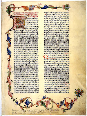
The production of graphic material, inventions and techniques start many thousands of years ago, I researched into a few historic graphic production and will include a short brief on my findings. Starting with the first ever solid book to be printed in Europe which was the Bible by Johannes Gutenburg in 1445 – it was made to a beautiful quality and extremely advantaged for that time, being produced on the printing press. Being as beautiful as the pages were they came with a price, literally, depending on how much the buyer was willing to pay depended on the decoration and detail they got, some of the books were never completed to their full potential.


Even the use of drop capitals to begin each paragraph has been used, and the use of the grid system, dividing the paragraphs for an easier read. This book is a strong advanced early stage from the 1450’s, of how the graphics of this page are still in practice in graphic theories and techniques that are still around and used today.

Overview: Principles of Production for Visual Communicators

A Brief History of Production  *

Essential Milestones

The Design Workflow *

From Novice to Expert

The Experts

Ideas & Structure: The Character's Design

An important part of any film is the choices of character, the design of them and what role they play. Dividing the ideas and research them you can categorize into 4 aspects of that character. Whether it is the protagonist, who is the main character and we go through the movie with their experiences. Typically the protagonist is the ‘good guy’ but doesn’t necessarily always be ‘good’ or the antagonist – the cause to all the conflict. You then look at dialogue of the character, their speech, how they talk, and choice of vocabulary to determine what type of person they are and lastly not to be too stereotypical, nobody wants to see the typical simple character with no originality.  

We can then look at appearance, choice of clothing – matches personality? Action, what does the character actually do and how? Interaction, is the character relatable are they similar to any other characters – is there a connection?

Ideas & Structure: Three Act Structure

The 7th ITAP lecture was focused on the Ideas and Structure in moving image, and discussed the ‘three act structure’ where at the beginning of the movie the plot is ‘established’, the audience gets familiarised with characters, location, relationships, the next part is the most important as there will be a change in the main character’s life, there is the ‘crisis’ which disrupts the balance we had before. The rest of the film will be the development and adaption of the characters to ‘resolving’ the crisis. Bringing the whole film together at the end with the right balance restored. An example of a film that follows a three act structure is “Taken”.

At the beginning we are established with a perfect family balance, Bryan is a retired agent who has a 17 year old daughter Kim, who lives with her mother and stepfather. Kim manages to convince Bryan to allow her to travel to Paris with her friend.

Until the crisis begins when they share a taxi with a stranger, who finds out where they are staying and that their alone, resulting in them being kidnapped by an Albanian human trafficking gang. Kim manages to hide under the bed to phone her dad but doesn’t give enough information before she is taken. He has 96 hours to find her before she is gone for good.

The crisis is resolved when Bryan pieces the clues together and races over to France to save her, brutally killing anyone who stands in his way. He has all the skills necessary and rescue’s her safely, bringing her back to her home.

Overview: Principles of Ideas and Structure

5 principles for the development of ideas and structure in moving image.

Story development: Three act Structure

Story development: The Hero's Journey

Pre-Production: Character design

Visual development: Visualising Information

Future Film: Digital storytelling

Production & Outcomes: Interpretation & Testing

Due to illness I missed this lecture so hopefully caught up and had an understanding of what the powerpoint slide show was about!

I first looked at interpretation as all artists’ work will reflect on the particular era they were/are in, this can be known as the ‘zeitgeist’ of their time. This will be relevant to the time and environment and has been particularly expressed through art, literature and religion. Art will never get old because as time goes on there will always be different interpretations of an art piece and with slight alterations or added text could completely change the meaning of the piece. Artwork from long ago can influence other artwork and also be re-worked in a different time to have a completely different interpretation to its audience.  

Being a creative practitioner you need to be able to represent yourself and test your work out, letting it be accessible for others to see and judge. Keeping up a continuous effort to maintain some form of online progress of your work and being flexible about getting your work shown around as much as possible, whether it’s the internet, blogging, photo pages, galleries, social forums etc. and through doing this it can help you gain the feedback and reaction you need to further your potential and develop your work for the better.
 
http://www.flickr.com/photos/73456863@N06/?saved=1

Overview: Principles in Production & Outcomes

Interpretation – Illustrators/Creatives select and use a zeitgeist to interpret the message. Time and place has a great effect on their production

Delivery - By choosing from a myriad of platforms Illustrators/Creatives select an appropriate format

Medium – Illustrators/Creatives utilise both client based, commercially driven projects together with self-initiated and collaborative work

Testing – Illustrators/Creatives disseminate their work through published work, galleries, websites & blogs, creative & social forums

Methodology - A thorough and versatile design process enables an Illustrator to work independently and professionally

Visual Communicating: Legibility & Tone of Voice

Visually communicating something to an audience in an effective way all depends on a few key factors. You may have outstanding imagery but how will it be used and is it easy for the audience to understand and interpret? Is the message clear from your choice of images?

As our project was designing a magazine, this lecture was of particular use as I was able to learn and concentrate my research on the legibility of the design, considering the layout and style for that audience, making sure there is a clear typeface and aligned text correctly. This is a key point when designing your articles, are your paragraphing well thought out? Is the title clear and stands out but doesn’t over power the page? Need to take into account the text size, the alignments and the structure of the image to text ratio on the page. Does the content represent the images and vice versa?


What about colour? Colour is a big deal, as certain colours really do not work on a white background and you want to make it look more visually appealing but being careful to not make a mistake with the colour. Some colours could be misleading when it’s matched with an image, images tell a story and the colour of a text caption could spoil the audiences initial thought of the imagery.
It is important to think about where the magazine will be shown, a standard type size of 12 is acceptable for a magazine/essay piece but being shown on a large screen won’t be readable.

Here is an ad campaign for the NHS for stop smoking, this is a simple and effective advertisement. The style is a cloud of smoke coming from the cigarette with the text fitting inside of it and even the font is designed as a smoke effect. The legibility of the graphics, typeface and layout works well for this poster.


What is also essential to visual communicating a written piece is ‘tone of voice’; this can be represented through choice of font LOUD - quiet ’, style of typography, size and colour (for example when filling out forms different sections are highlighted – informative, helpful etc. giving you guidance through just changing the colours)

I looked at another NHS campaign poster but this one has a clearer tone of voice on it. The text is written in a child like hand written font, giving the audience recognition that it is a younger person’s quote and a shocking statement from a child. Giving this stop smoking advertisement the shock factor as its personal elements comes through with composition and typography choices. The small basic font at the bottom of the page shows authority and informative speech. It clearly shows that tone of voice and the legibility choices you make are important on delivering the correct message to the audience.

Overview: Principles for Visual Communicators

Five ideas and principles that is relevant to your subject area

Legibility

Researching the content

Researching the practice

Tone of voice

Visual hierarchy

Creative Process: The Audience

An important part of researching is your target audience, as you want to have a clear understanding of what you’re targeting to enhance how you communicate to them and how to specifically attract them towards reading your magazine and control what they are getting from it.

When researching, it’s better to not just typically go for ‘age, gender etc.’ but for lifestyle, common interests or a social grade they fall under. Looking at the NRS readership for magazines I was able to pick up magazines from the shelfs and see their typical formats and then compare with the proven data of age and social class to see how certain styles attracted a certain type of group.


Our magazine is a combination of photography and illustration to text, which documents our interests of Birmingham. Taking influences from fashion and art with articles that have been written from personal experiences. Referencing the Jewellery Quarter, Lost in Lace exhibition and the Custard Factory! We decided our target audience was better suited to females, aged 17-25, and students/working class with an interest in art, museums and fashion history.
Here are some pages of my audience research taken from my RVJ of current magazines on the market that target similar audiences of females, 17-25 with fashion interests. Showing my understanding of layout, colour styles, fonts and what articles demand more attention for the audience. I researched into the style of font and how the titles and articles were written.

Creative Process: Research

Research is such a broad and key element done by more or less everyone in any line of work, but being visual communicators we have to put into practice the use of visual research by drawing and surrounding ourselves in inspirational art and always taking notes and collecting images from any type of medium. 
 
There are two basic overview factors to research, narrowing down to ‘primary and secondary research’. Primary research is beginning from scratch; there is no data or information around for the researcher to use, and therefore will have to be original. The advantages for this would be that you know where the sourced information is from; it will be first person and original. For my article I decided to do a piece on the jewellery quarter and although there are basic facts on the internet I wanted to go first hand to the museum and take notes of my experience, talked to the staff and had a tour around the museum to collect my own research and photos.
Secondary research provides all the necessary information that you want, from books, magazines, videos and other media. The majority of my research has been secondary as I wanted to really get to know magazine layouts, styles and fonts. Looking at how they work, and adapting different styles of them, why it may or may not work.

I have scanned in a double page spread of front cover research from my RVJ of 'Stylist magazine' that I thought may help towards my magazine.

Overview: Principles of Research & Inspiration

Key principles for the lecture 'Research & Inspiration:

Through the ‘visual practice’ of observation, collecting, studying and exploring a subject, topic or theme, this will contribute to a deeper understanding of the subject (Research)

By understanding the various ‘practices & processes’ of illustrators, designers, photographers one is able to progress and advance one’s own practice

The notion of ‘inspiration’ derives from constant inquiry, based on research, observation, recording and experimentation

The application and evaluation of drawing and media experimentation is key to the development of a ‘personal’ Visual Vocabulary

An understanding and knowledge of ‘an audience’ should enhance and focus the communication

Connectivity - Cultural Context

Cultural context within your chosen medium is a crucial aspect to consider in artwork. Culture is in all characteristics of life around us, ideas, meanings, values and beliefs all shared by individuals. You need to think about this when it comes to art, think where the artwork is going to be placed, is it a different country - there will be a difference in cultural background, how could go around that and will it still change the views on the image. It could cause offence to some people and as time moves on what might have been acceptable in the 1950’s will not be now and vice versa, so age will need to come into consideration too.  


The context of any art can change its message and the way the audience will perceive it, by getting away from the original context as the culture surrounding change.

Connectivity - Notions of Originality

Looking at any art work and seeing through it to any original influences it may have had, is something I would rack my brain about but never could pin point exactly its originality just that I knew I’d seen it before, I could pin point a few recognizable gestures that would relate to an older piece of art but I find myself usually being the one that says ‘oh yeah’ after the answer is revealed, much to my amusement of this ITAP lecture where we compared different art work/advertisements that used iconic art as influences to other pieces.


Many advertisements use this technique because it is recognizable to the public and can symbolize a trigger in your brain to encourage you to remember the advert, and may result in you buying into the product. For example this E.T poster has a recreational influence from Michael Angelo’s The
Creation of Adam painting on the Sistine chapel ceiling, by just the image of two fingers touching which has been imitated and parodied throughout the  years.


Now it’s hard to see what is original, you could argue that everything in this day and age has some kind of influence to it. With the technology and numerous types of media surrounding us, it could prove to make things slightly more difficult to do something 100% completely original because subconsciously your brain will be taking in everything visual around you, so the next time you sketch your thoughts kicked in with your memory will create something, you may have already seen.

Monday

Overview: Principles of Connectivity

Five principles of the connectivity around art, illustration and photography.

Notions of Originality

Cultural Context within your chosen medium

Relationships developed from existing forms of historical culture

Bricolage and it's use in contemporary culture

Pastiche, Synchronicity or Conceptual appropriation

Creative Thought - Managing a Creative Environment

Being a creative person can reflect through many different aspects, whether it’s through a choice of appearance, i.e. the clothes you wear, or showing through your work, and more importantly the environment you live, study or work in. Creativity is not just internal but will radiate externally, it can influence your work by the environment, culture and personal interests you surround yourself in. It can even help assist in the production and stimulate your thinking processes, and aid toward broadening your mind. So I find myself always collecting anything in whatever form that may have an influence on my work, I try to show my interests as a creative practitioner.


I researched around for different work spaces to give an example and found a picture of Johnny Ryan’s inside studio, as I read his blogging type website sometimes anyways was good to actually see one of his work spaces. Being a cartoonist it looks surrounded in colour and has a whole shelf of figurine characters and a well lit slanted desk!

Here is a photo of my own small room in halls. Decorated fairly simple as there were rules of ‘no blue tac wall stains’... ‘no holes in walls’ and my desk is packed in. However I like my room and it has the perfect balance of my photography pieces/some of my favourite Illustrators (Sophie Griotto, Christina Drejenstam and Rob Bryan) I’ve also got a row of some of my perfume adverts I  always collect!  Of course I’ve got my ‘Discover our fragile Earth’ calendar which has gorgeous wildlife photography pieces from all around the world. I am also fortunate to have quite a large desk!


The wall does go more round to the right showing more work but I already didnt do a good job of stitching the first two photos, so gave up on the third.

Creative Thought - Developing Ideational Fluency

Ideational fluency is defined as ideas that are made through different techniques such as mind mapping. Where you develop ideas into great detail and cover all different factors that make up just your one idea.  Having a clear mind-map to work from can boost your creativity and can be an effective way to see the connections as you travel through ideas and see how your thoughts work when your jotting stuff down. It can also help towards remembering information as your able to space your writing out and draw useful images to relate the pieces together.
Being creative and spontaneous in how you think when generating your ideas will help towards your development and fluency of the designs, especially if you have ideas that you need to present and demonstrate to someone else. Having a clear understanding of how you note and develop your ideas can make you more confident in achieving your finished project.
Here are some examples of mind mapping and drawing visual ideas for a storyboard taken from my RVJ. I have began drawing out mind-maps in my RVJ as I found I could generate my ideas more efficient and it also can demonstrate how we worked through different ideas for the 10 second animation. We were then able to pin point an idea and draw it onto a storyboard to show our final idea come to life.